April Phelps is a LEED-accredited designer who works at the New England Aquarium creating new exhibits and enhancing existing ones. Boston’s New England Aquarium is one of the many non-profit organizations to which we’ve granted SketchUp Pro licenses as part of the SketchUp for Nonprofits program.
SketchUp Pro has been a big help to us in the New England Aquarium Design Department. The Aquarium was founded in 1969 and attracts over 1.3 million visitors a year to our waterfront location. Recently the Aquarium’s capital improvement plan called for a complete renovation of our changing exhibits space, and we decided to part with the Aquarium’s traditional design aesthetic and embark on a new path.
The newly completed exhibit we designed in SketchUp Pro is called The Trust Family Foundation Shark and Ray Touch Tank. It features sharks and rays in a mangrove-themed tank surrounded by shallow edges and viewing windows, allowing visitors to experience a close encounter with these animals.
The exhibit presents these incredible species in a way that highlights their importance in a healthy ocean ecosystem. It also emphasizes the value of conserving essential coastal habitats, such as mangroves and lagoons. During evening hours the new space is also used as an event venue for private functions.
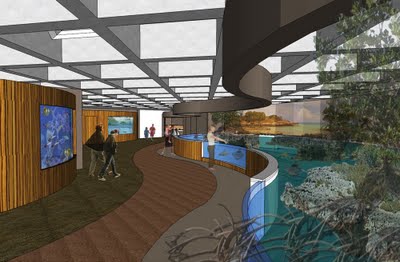
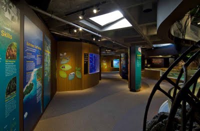 View from the entrance of the shark and ray touch tank. On top is our design phase
rendering; below is an opening day photograph.
The Aquarium provides unique challenges for designers. We have a variety of internal clients with different needs, and we need a modeling program that works quickly and accurately to convey our ideas. SketchUp’s quick modeling capabilities provided me the extra time needed to explore multiple design options on this project.
SketchUp also enabled our design team to give everyone at the Aquarium a sense of the new exhibit’s aesthetics quickly and easily. In addition to quickly creating renderings, we imported actual material samples into our models. This allowed staff and visitors to get a sense of scale and of how significant the interaction with animals would be.
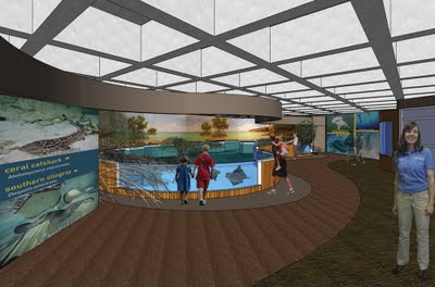
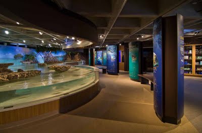 View from inside the exhibit towards the Lagoon and Cassiopeia tanks. Above is
our design phase rendering; below is an opening day photograph.
Our traditional design aesthetic for the Main Building is to make the visitor feel like they are submerged underwater, looking through portals to all the fish. The new exhibit needed to be airy and bright, allowing visitors to feel that they are no longer submerged but at the beach level interacting with the animals. To achieve this we revealed the once covered up skylights and installed a significant amount of energy efficient lighting. With natural and artificial lighting we simulated the feeling of wading around a beach touching sharks and rays.
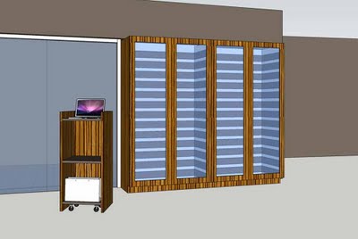
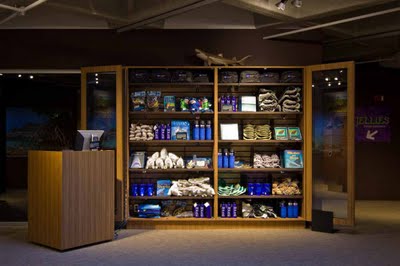
This “no surprises” methodology allowed us to receive design input from different departments quickly. Given our very tight schedule and lack of resources, it proved to be most helpful. We’re excited to continue to use SketchUp Pro on future projects and renovations at the New England Aquarium.


3 comments :
I am an exhibit designer who uses twitter and one of the great things is being able to easily mock up exhibit graphics by editing textures and reloading the source fine. It's so easy! With content on so many different surfaces and media, it's great to have a tool that lets you easily test out ideas before moving on to full production. It definitely makes me more adventurous as well as saving me time!
oops I meant "I am an exhibit designer who uses Sketchup"
Ha Ha.... Chris, I almost want to open an twitter to see how it works.
Post a Comment