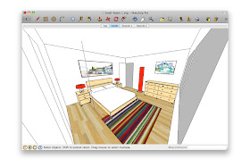
 Standing in the corner and making your Field of View really wide is just weird. What are you—a housefly?
Both of the above techniques work—to a point. Personally, I think it’s like trying to read a book through a keyhole. By far my favorite method for working on small interiors is to make use of SketchUp’s ability to have faces with different materials on each side:
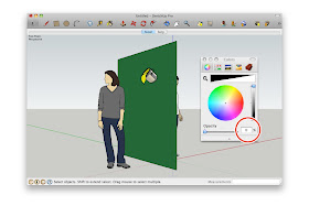
Creating a completely transparent material and painting the green side makes it see-through.
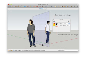 The Entity Info dialog box shows that the selected face is yellow on the front and see-through on the back.
 The Entity Info dialog box shows that the selected face is yellow on the front and see-through on the back.
By painting the outward-facing surfaces with a see-through material—one whose opacity is set to 0%—I can see in from the outside. Super useful, super simple.
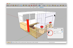 Here, I painted all of the outward-facing surfaces with a transparent material. Notice that the interior surfaces still look opaque?


smart and clever !
ReplyDeleteVery cool
ReplyDeleteSuch a simple solution.
ReplyDelete...Although this would not work when you have something like a series of rooms beside each other... hmm... Any ideas for when your small space is not isolated? Such as if you have two or three of those example rooms beside each other??
ya ya . . . :)
ReplyDeleteVery useful, thanks
ReplyDeleteDoes this method applicable when rendering using vray, ie where the lighting outside doesnt directly go through the transparent wall and affect the internal lighting?
ReplyDeleteIt's a good idea when we are only in the presence of a room, although I find most useful to divide my model in different groups (walls, roof, ceiling, rooms) and hide the group at convenience. Combining this technique with Section Plane I have found the best way to access the interior spaces. The planes of sections can be placed at 1” from the inner side of the wall and that allows me to use Camera Position and Look Around to have a “real” view of the inner space. Perceiving the space at an eye height helps interior designers to evaluate the impact of objects, furniture and colors that we place inside a room.
ReplyDelete@Oink - In multi-room models I make heavy use of the Outliner. Each room is its own Group, so that when you double click the Group (i.e. the room) it is shown in isolation. Check out my models to see what I mean.
ReplyDeletehttp://sketchup.google.com/3dwarehouse/search?uq=1700528911561020539346347&scoring=m
That's an interesting trick...
ReplyDeleteWhat I usually do is makes walls into separate groups (as others have noted) but also assign them to layers, like "east wall", "north wall", etc.. I find it easier to turn things on and off from the layers list rather than hiding/unhiding. The other advantage is that if there's stuff on or against the wall that I'll also need to see through (art, bookcases, etc.) they all just get assigned to the wall's layer. The transparency trick won't work for that.
Yes, quite a good method, another one I use is the use of layers, some walls belong to one layer and others to others, and you decide to get some layer desapear and not another.
ReplyDeleteEnjoy Google Sketchup
I've done ceilings that are opaque from the inside, and transparent from the top to allow light to shine into a space for interior views, which has been handy.
ReplyDeleteThe huge problem with that method is when you try to zoom inside the room with the mouse wheel. You have to roll it a dozen times to get through the wall because of the way SU slows down the zoom as you approach a surface.
ReplyDeleteI have requested a CTRL or ALT override to cancel that slowdown of the mouse wheel in the past, with no luck.
c'mon, I learned this in 2006.
ReplyDeleteI love you all!
ReplyDeleteWhen modelling rooms and I want to see whats inside I tend to place elements of my models onto layers eg a roof layer, wall 1 layer. And if i need to see whats inside I just turn the layer on and off - simples!
ReplyDeletevery cool and inspiring again, Aidan. Thank you!
ReplyDeleteIf anybody likes, here is a short HD video using this technique: http://www.youtube.com/watch?v=zA7rhZ1AA9w
:) very nice :) :) :)
ReplyDeleteI like this method as is Ideal for viewing a room. However, it is not good for editing because you can not select objects in the room. In this case Field of view, deleting the roof, using layers to hide the wall or section planes are more usefull.
ReplyDeleteGood but ... Best, would be to create a new material - similar but w/0% opacity, and use it all around the walls (and later reset its 100% opacity).
ReplyDeleteThis way, you are sure that photo rendering will be perfect with this material, and you will reset everything in just one B click.
Another way - the one I use the most -, is to build walls (in Brazil every of them are thick bricks) cropped by 45 degrees in the corners, and making groups; so that I can hide them anytime. It helps too much when I "take pictures" of my scenes, exporting in SketchUp or photo-rendering outside.