
While putting together a demo SketchUp file to use in our booth at the AIA National Convention last month, I worked out a nifty little technique that I think is worth sharing. Here’s hoping you think it’s nifty, too.
The problem I was trying to solve was this: SketchUp’s Section Plane Tool cuts away parts of a model to show sectional views, but it doesn’t “fill in” the spaces between wall surfaces, floor slabs and other areas that are intended to be solid in a design. Often, architects will blacken or hatch these interstitial areas to help their drawings read better. This filling-in is called poché, and SketchUp simply doesn’t offer an automatic way to do it.
 By default, SketchUp thickens section cut lines, but the spaces between the faces aren't filled in (above).
 Sometimes, it's useful to show section cuts with solid shading.
I wanted the SketchUp file I was preparing to look "pochéd" no matter where it was sliced. Furthermore, I wanted that poché to carry over when the model was inserted into LayOut.
I started by using the Section Plane Tool to cut a section through the model (as seen below). I oriented my view to be perpendicular to the section cut by right-clicking the section plane object and choosing Align View. Since I wanted this to be a true, scalable orthographic view, I turned off perspective (Camera > Parallel Projection). Finally, I created a new scene; doing so made navigation easier, and was necessary for creating a viewport in LayOut later on.
 An overall view of the model
 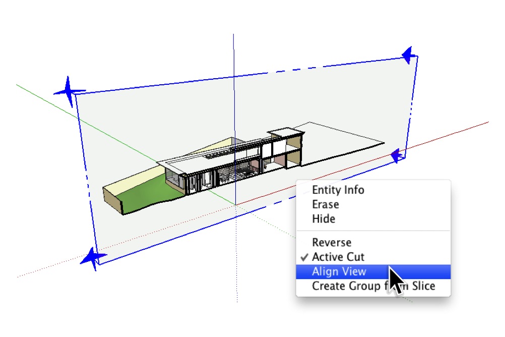 After adding a Section Plane, I right-clicked and chose Align View.
 This is the right view of the model (above), but true orthographic projections don't include perspective.
 Choosing Camera > Parallel Projection from the menu bar turned off the perspective.
Now for some work with Styles: As this would be a black and white, sectional view, I chose to apply the HiddenLine style from the "Default Styles" collection that ships with every copy of SketchUp. This style uses thickened edges to indicate cut-through faces, but (as I mentioned earlier) it doesn’t fill in the areas between them. Perhaps more annoyingly, edges which exist beyond the section cut still show up in cut-through areas (see below). This is visually distracting and not at all acceptable for professional work. If I’d turned in drawings that looked like this in architecture school, my professor would’ve made me run laps around the studio.
 Applying the HiddenLine style turns the model black and white, but there are problems.
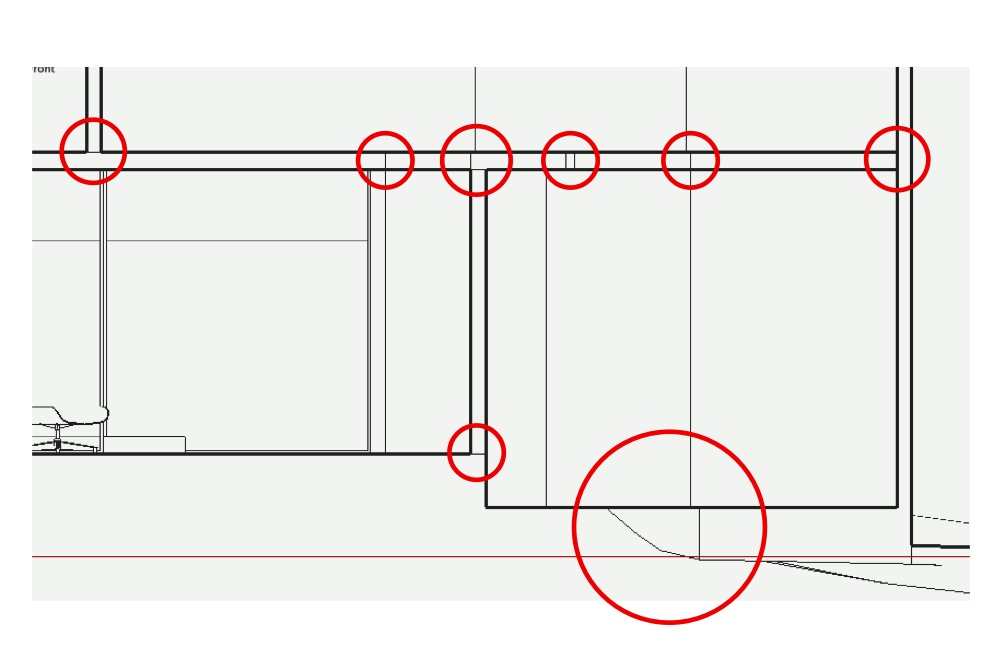 Edges which exist beyond the plane of the section cut are plainly visible. This isn't desirable.
Revelation #1: Monochrome is the answer
This helpful post from last year gave me the idea to use the Monochrome face style to automatically turn the “fronts” of my faces white and the “backs”, black. See the following image for a visual explanation of what I did.
 I selected the Monochrome face style and chose white and black for the default front and back face colors.
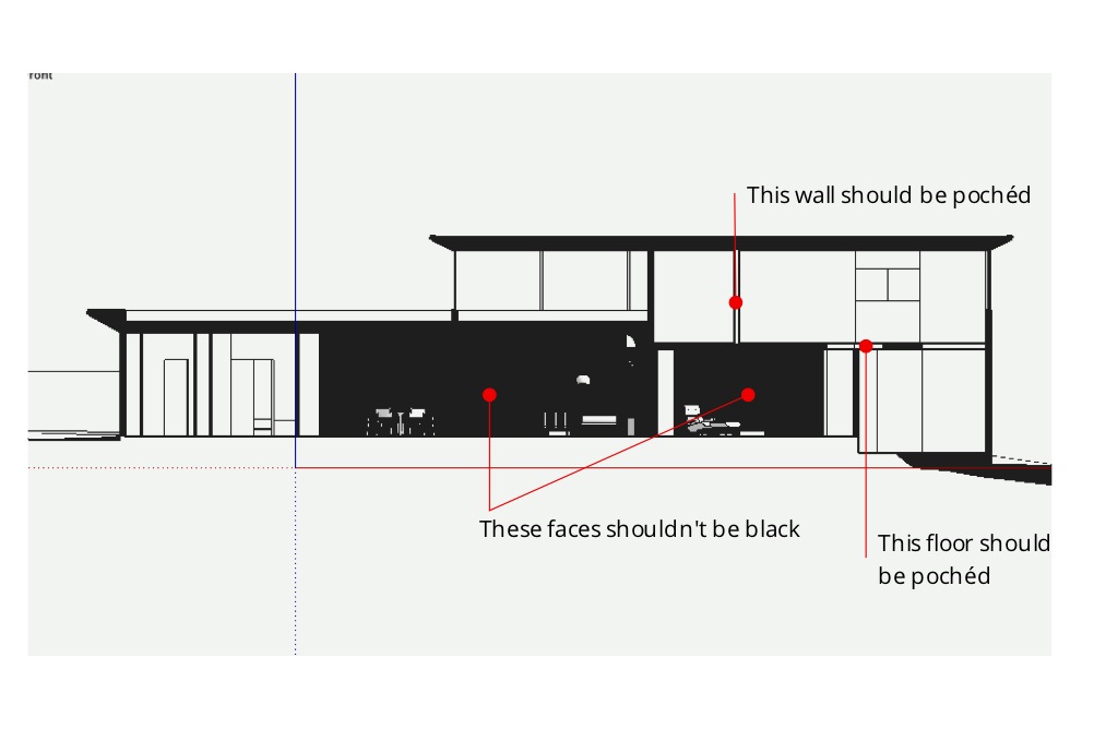 The above settings work well, except where faces are "inside-out".
Hmm. It was clear that I had a little cleanup work to do; some of my faces were oriented so that the back-side was facing out (above). To make it easier to see what I was doing, I changed the Back Color to something lighter than black, then spent a few minutes turning the offending faces right-side-out by right-clicking them and choosing Reverse Faces. I ended up turning off Section Plane object visibility (View > Section Planes) to make faces easier to select.
 Temporarily changing the default Back color to yellow made it easier to see what I was doing.
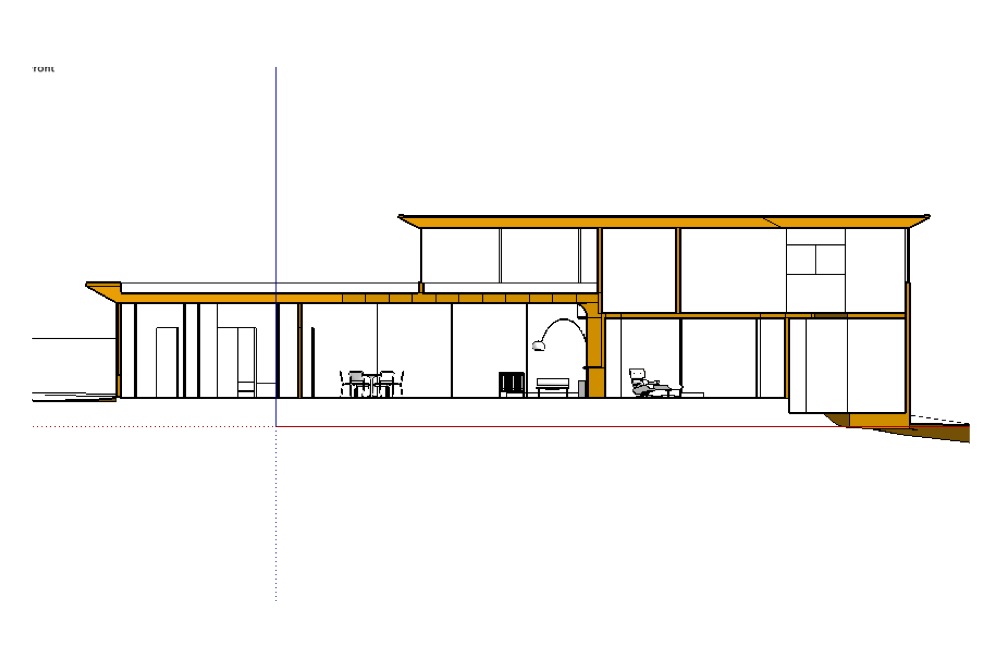 I spent a few minutes reversing the offending faces.
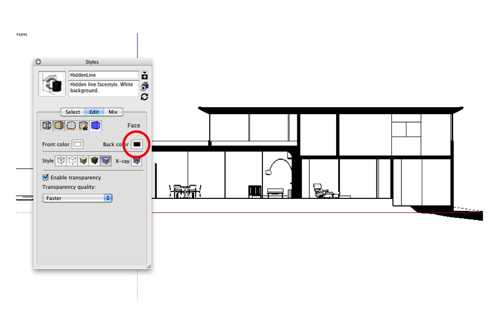 When I was done, I set the Back color back to black.
Revelation #2: Slim down section cuts
My next problem was easy to solve. The thickened-edge effect that makes section cuts stand out looked too heavy when combined with my newly-pochéd in-between areas, so I made them thinner. You’ll find this setting in the Modeling tab of the Styles dialog box (see below).
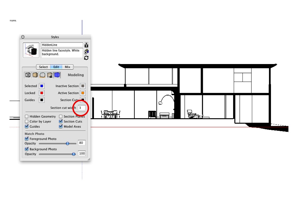 The default section cut thickness setting of "3" looks too heavy when combined with poché.
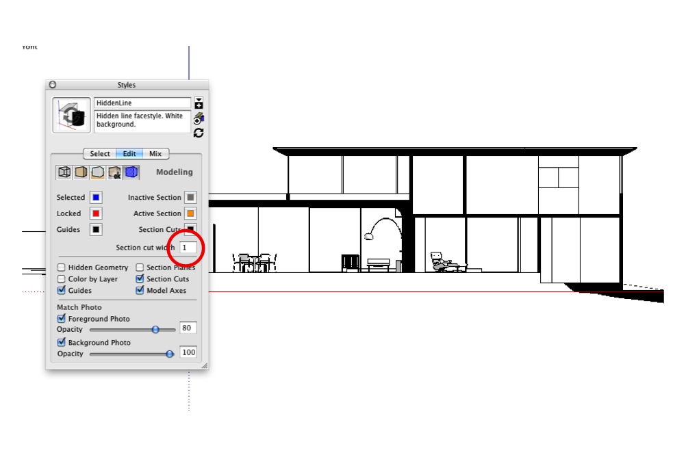 A setting of "1" looks much better.
Revelation #3: Hide Section Planes
While I was in this section of the Styles dialog box, I made sure Section Plane objects would never be visible when my style-in-the-making was applied. I deselected the Section Planes checkbox.
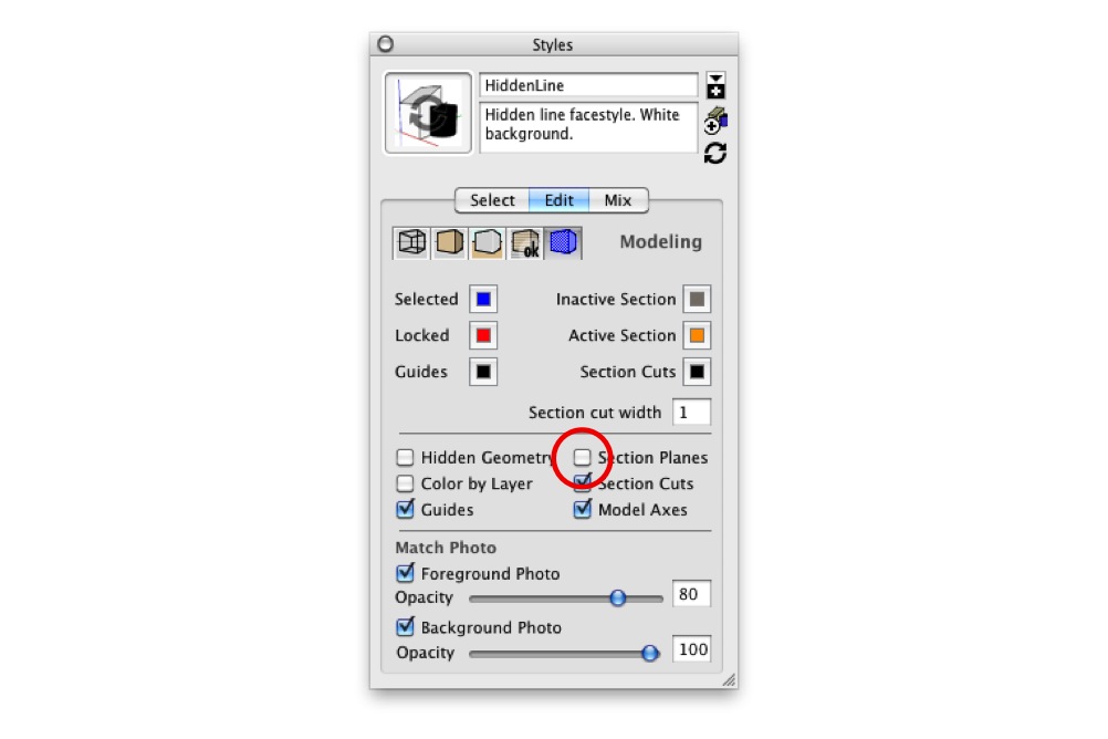 Uncheck the Section Planes checkbox while you're in this section of the Styles dialog box.
Revelation #4: Eliminate roundness shading
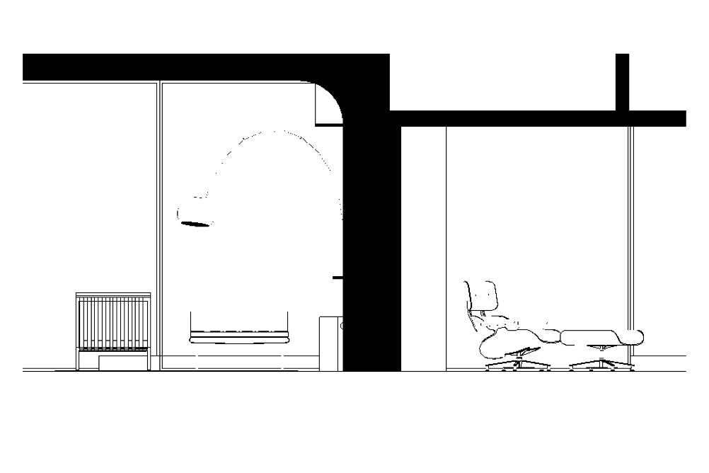
The next challenge I faced was a little trickier. In the following image, notice the shading gradient that defines the curvature on the underside of the Eames lounge? On a true, linework-only drawing, this shading wouldn’t be visible.
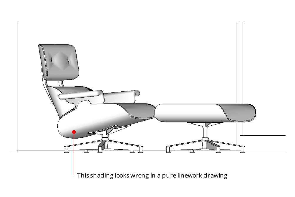 The shading in the above image looks nice, but it isn't appropriate for the drawing type I'm trying to create.
This shading is an automatic result of SketchUp’s built-in rendering engine. It’s usually very useful, but I wanted to get rid of it. After messing around for a few late-night minutes, I figured out how. The key is to do two things:
- Turn on “Use sun for shading”. This tells SketchUp to use its shadow engine to render faces, even if shadows are turned off (which they probably should be).
- Move the Dark slider all the way to the right. A setting of 100 for Dark means that shadows basically aren’t visible. This eliminates all curve shading in your model.
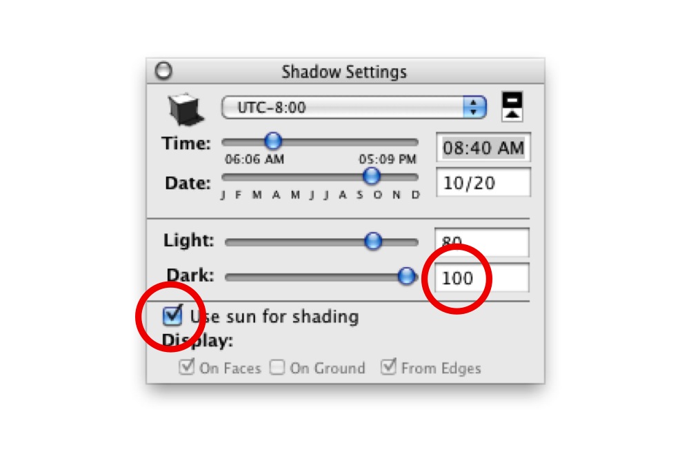 Turning on "Use sun for shading" and setting the Dark value to 100 effectively eliminates roundness shading.
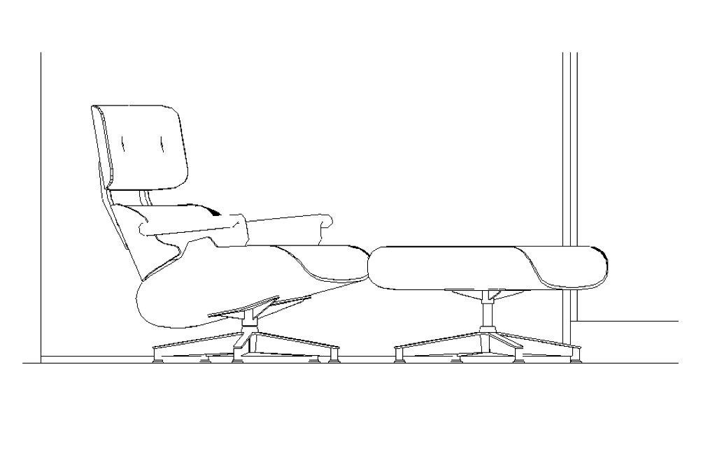 Having removed the shading, I'm left with pure black and white linework.
In keeping with my earlier discovery of the benefits of setting my Profile thickness to “1” (instead of “0”), I did so. This allowed curved, multi-faceted surfaces to appear outlined without making the boundaries of every group and component in my model look too thick. The images below show the before and after. Much better.
 With Profiles turned off altogether, some rounded objects aren't visible.
 Control Profile settings in the Edge section of the Styles dialog box.
 With Profiles turned on and set to "1", rounded shapes like the lamp on the left are clearly visible.
One more thing
I wanted a nice, thick base for my house to sit on, so I modeled one. Since the base was hollow, the poché trick worked here as well.
 I added a thick base to the model.
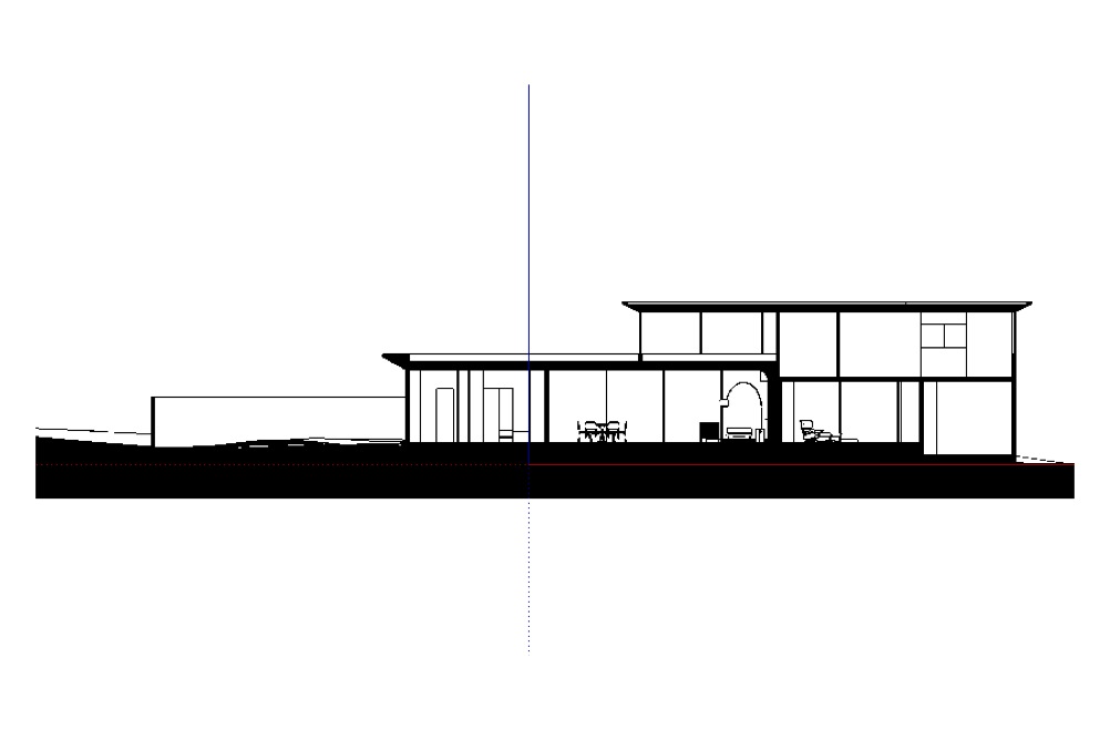
When everything was set, I created a new style and called it "Section Cut". With this style applied, things looked just the way I wanted them to, no matter where I cut through my model.
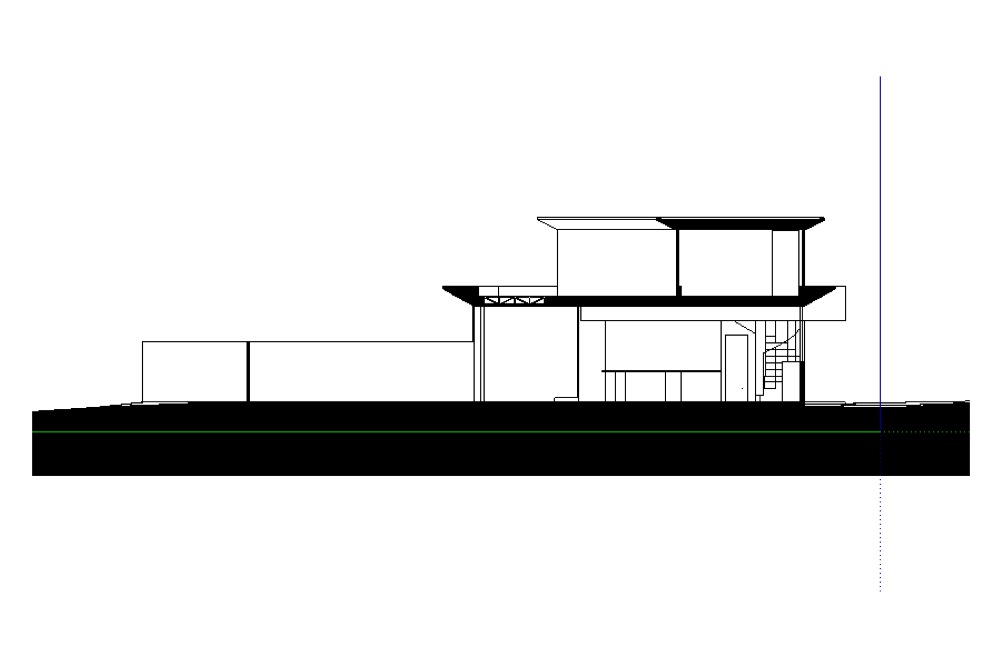 Short section through the same building
 The poché trick works just as well on plan sections.
19 comments :
me like watch draw have sketchup know find know good yes
hooray ! nice trick !
Section cuts have certain rules which in most cases are not followed using a straight cut through the building, so in that case I dont see this technique replacing selectively drawn section cuts,BUT for Plan views it is AWESOME. Great article and another proof of why I like sketchup so much. thans
Great stuff! Can't you use Hidden Line view to eliminate shading?
I use Sketchup to do construction and visualization drawings for solar energy products on rooftops. I often need to detail attachment methods with section cuts. This tip helps me go from my customer oriented renderings to my engineering oriented sketches with ease. I discovered a lot of the style tricks a while ago, but the poche tricks are the final touch I needed to make the transition easier by implementing a new style into all of my models. Thanks!
Thank You for this detailed tutorial, I found it very helpful!
very nice and easy to follow tutorial...however, this technique will not eliminate shading of angle faces (such as those on a typical A-frame roof) so unless you have a flat roof, cutting building sections this way won't quite work...unless there is a work-around perhaps?
I found that where the far face of one group is touching the near face of a group beyond, the "poche" doesn't work. It's reversed to 'white'. Example: Try (2)2x4 top plates interlocked conventionally on an outside corner. (All 4 pieces are groups). Good so far? Now create 2 plywood groups to attach on each side. (Drats! Foiled again!)
can it be made to work with colour or perspective type sections?
can you post the style as an element that can be imported?
I use a free plugin called 'make faces'.
I create a group from section slice, explode any groups right down to lines.
intersect all/any lines to help the make faces plugin 'fill the holes'...
usually have to help it along by finding the gaps to fill the last few..
then delete the faces you dont want filled, usually only a couple for room voids etc..
I can then texture up as a solid colour or use relevant materials for different elements depending on what the image is for.
You then follow same steps re align view to section plain and camera perspective..
This is quicker than it sounds! but you would have to do it for every section you need. Also you have to move the section slice group at least a mm away from the section cut so that it shows up in the model.
I do like your method, will try it now !
Hi Aidan, thank you for a great tip. I'm sure you've already thought of this - but what happens when you have a single plane object like glass in a window which will have a wrong side or black side using the monochrome style depending which side you view your section from. Maybe others are making windows with double planes of polygons I don't know?
I second Vinny S's comment. This is truly a useful technique. but not fool proof. Where you have floor construction and wall construction meet there is always going to be a double-face "z fighting". Unless off course you are using Spetchup 8, turn walls and floors into solids and boolean together the whole thing as to eliminate double faces where walls and floors meet.
Penumbra Design, please what do you mean by "turn walls and floors into solids and boolean together the whole thing"? I also have problems with that "z fighting" and can't manage to solve it. Thank you!
The SectionCutFace ruby script does the same thing, and it's much more simple.
You can find it here:
http://rhin.crai.archi.fr/rld/plugin_details.php?id=361
Drop it in your sketchup plugins folder under program files. Open Sketchup then use the section cut plane, right click it after you make a cut, and select "Add Section Cut Face", and you're done.
I am pretty new to SketchUp and yet I liked your detailed step by step tutorial to overcome a problem. I am just learning how to make the Poche you are mentioning... (so far i have drawing two lines to make a Poche like outcome. For example, I will draw a square and then draw another within that square to make the walls six inches thick!) Thank you for the lession!!! - siddharth
Well Done, nice tip! Very helpful...Thanx!
wow, after all that....I think I'll just hatch my sections in AutoCAD...takes me two seconds and it's made to do just that...no workarounds. Sorry to be a spoilsport, but I use SketchUp for stuff I can't use Cad for and Cad for stuff I can't use SketchUp for. They are each tools in my toolbox that work just great for the things they are made for.
does sketchup have a default for different materials, so I can determine the amount of material needed? For example, for the walls. how much plywood is needed or glass is needed to cover that exact dimension?
Post a Comment